A waffle chart is basically a square display that shows progress towards a target or a completion percentage. They can be a fancy alternative to pie charts. In this guide, we’re going to show you How to create waffle charts in Excel.
Creating a waffle chart
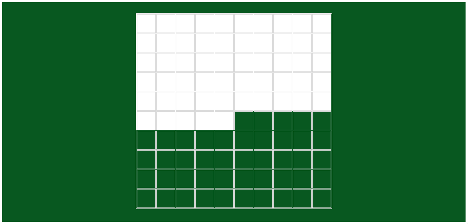
1. Create a 10 x 10 grid
A waffle chart needs 100 cells to refer to each percentage value. Although you can prefer a rectangle shape, a 10 x 10 grid is a conventional way to create a waffle chart. Start by equalizing the columns' widths with rows' height.

2. Fill cells with percentage values
The next step is to fill the cells with percentage values. The order is totally up to you. We will start from the top-left. Either fill the cells manually or use one of the following formulas to generate the values. Be warned that the first formula includes the SEQUENCE function which is supported to Microsoft 365 subscribers only at the time we are writing this article.
SEQUENCE Function (Microsoft 365)

Conventional Functions

3. Conditional Formatting
Once the values are in cells, we can use the conditional formatting to color cells according to their values.
- Select the entire grid.
- Go to Home > Styles > Conditional Formatting > New Rule.

- In the New Formatting Rule window, select Format only cells that contain.
- Make sure Cell Value and between values are selected in the Format only cells with
- Enter 0 and the reference of the cell contains the value.
- Click Format button to select a background color and other formatting options you want to apply.
- Click OK to apply the formatting.


Excel will highlight the cells based on their values up to the value in the cell C4.
Visual modifications
Values
Because we are done with the mechanics, we can start visual updates. It's obvious that the values in cells are not looking good. You have two options to hide them:
- Make the font color the same as the background. If you choose this method, do not forget to change the font color in the conditional formatting rule as well.
- Set a number formatting to ";;;"


However, you still may want to display the value. There may be lots of options to display a number in Excel. In this article we will show two ways:
Value in a textbox
You can use a regular textbox or a shape which includes a textbox to show the value of the chart. The advantage of an object is its movability. You can place it anywhere you want.
You can find the Textbox object by following Insert > Illustrations > Shapes > Textbox.
Once you add a textbox, select it by clicking its border. Make sure you cannot see a cursor in the textbox. Click on the formula bar and type an equal sign "=" following with the reference of the value.
Once you press Enter/Return key you will bind the cell value to the textbox.
Value in the last cell
An alternative and cool way to show the value is using the last highlighted cell. You can override the active conditional formatting rule by adding another one.
- Start by selecting the grid and opening the New Formatting Rule window once again.
- This time select equal to option for the Format only cells with
- Select the cell with the value.
- Select the formatting you want to apply.


Here is what you can achieve:
Borders
Replacing the regular thin black borders can improve the look of your waffle charts as well.