
SpreadsheetWeb blog
How to create a thermometer chart in Excel
A thermometer chart is a way of comparing two values. In this article, we are going to show you how to create a thermometer chart in Excel.
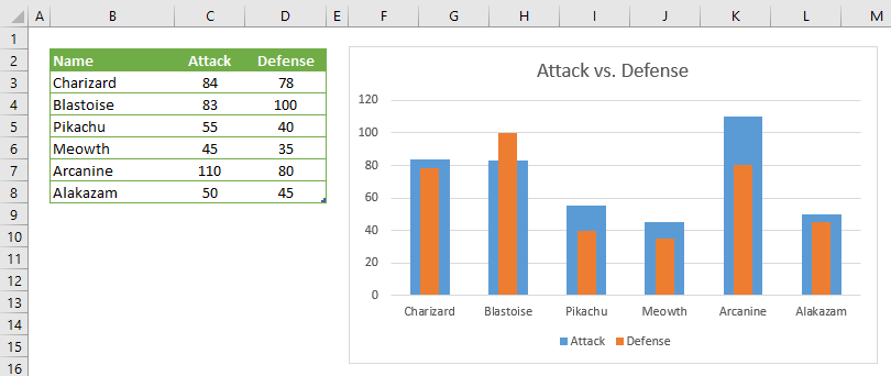
A thermometer chart is an effective way of comparing two values. Although Excel doesn’t support this specific chart type, there is a way to create a thermometer chart. In this article, we are going to show you how to create a thermometer chart in Excel.
Converting a column chart to a thermometer chart
What can resemble a thermometer more than a column chart? So, let’s start by creating a column chart.
- Organize your values as a table and select any cell in the table. Selecting entire table is OK as well.
- Activate Insert tab in the ribbon
- Click Insert Column or Bar Chart icon in Charts section
- Select Clustered Column under 2-D Column Chart

Now, we have a column chart which is still far from a thermometer.
Let’s start to modify the chart. First step is to activate secondary axis for one of the data series.
- Select one of the data series and right-click to open the context menu
- Click on Format Data Series to display properties pane at right
- Select Secondary Axis in Series Options

These steps make columns overlap each other.
The next step is to distinguish data series.
- Select the data series you kept at primary axis
- Re-open the properties pane.
- Reduce the Gap Width. Our value is 98%.

As a final touch, remove the secondary axis to improve look and feel.
- Right-click on the secondary axis to open the context menu
- Select Delete to remove

In this guide, we tried to summarize how to create a thermometer chart in Excel. Here is the final product: