Resources

How to Use Excel Sparklines for Better Looking Tables
Understanding Sparklines in Excel Sparklines, often referred to as 'inline charts,' are compact visual representations that neatly fit into individual cells within a spreadsheet. Unlike traditional charts, sparklines don't have axes or coordinates, providing an...

Scatter Chart in Excel
An Excel scatter chart visually displays data points on a grid, with each point determined by values on the x-axis and y-axis. This type of Excel graph is handy for illustrating the relationship between two variables. The horizontal axis shows control parameters or...

Basics of Financial Modeling in Excel
Wikipedia defines financial modeling as “the task of building an abstract representation (a model) of a real world financial situation.” Financial modeling in Excel is a crucial aspect of analyzing and representing real-world financial situations. Excel serves as a...
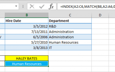
INDEX-MATCH Combination and Multi-Dimensional Excel Lookups
In the intricate landscape of Excel functions, VLOOKUP, HLOOKUP, and their precursor LOOKUP have long been revered as indispensable tools for data retrieval. However, their functionality is constrained by a unilateral approach, limiting their ability to search values...

How to sum by week number
In Excel, managing and analyzing data efficiently is crucial, and understanding how to perform specific operations can significantly enhance your skills. One such operation is summing values by week number, a task that differs from How to sum by month. In this guide,...

Easily Count Characters in Excel Spreadsheets with the LEN Function
In Excel, the ability to efficiently count characters within cells is a valuable skill. Whether you're identifying data types or setting up validation rules, understanding how to utilize the LEN function can streamline your workflow. In this guide, we'll walk through...
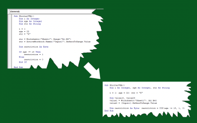
How to shorten VBA code in Excel
How to shorten VBA code in Excel In the vast realm of Excel and spreadsheets, mastering the art of writing concise VBA code can be a game-changer. The ability to streamline your code not only enhances readability but also makes maintenance a breeze. In this guide,...

How to customize AutoCorrect
Excel's AutoCorrect feature is a crucial tool designed to automatically rectify typos and enhance overall document accuracy. It extends beyond simple typo correction, aiding in the transformation of abbreviations into their complete forms, inserting symbols, and...

How to highlight quartiles in Excel
Quartiles play a crucial role in statistical analysis, providing insights into data distribution. Excel's Quartile functions, including QUARTILE.INC, empowers users to calculate these significant points efficiently. In this comprehensive guide, we delve into...