Excel keeps growing its visualization tools with each version. And the charts are the flagship of those. Although they present lots of customization options, they may become overwhelming when you just need to create a simple bar or column chart. In this guide, we’re going to show you an easy way to create charts with formula in Excel.
REPT Function
We only need a single function called REPT that can repeat a string a given number of times. This ability is a perfect function to create a chart in Excel bar or a column. The only trick is to choose a suitable character which can junction with the next character without leaving a space. Otherwise, your bar chart will not be seen as a regular one.
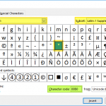
An obvious choice is the vertical line character you can find on your keyboard: | However, you will see spaces between each character by using common font types like Arial or Calibri.
The syntax of the REPT function is simple. All you need is to provide the string you want to repeat and the number of times to repeat.

To overcome this issue, use the Britannic Bold as your font type.

Normalizing repeating number
Your chart now resembles a proper bar and can be applied to your actual data, where the data represents your repetition count. However, using excessively large or small characters is impractical. For instance, populating a cell or range with thousands of characters isn't advisable. Additionally, Excel doesn't support decimal numbers. Therefore, it's crucial to establish a normalization factor for your dataset values.
Here is our data and how the bars are looking without a factor.

To make them fit into the designated cells, we need to divide the values. A formula will be like the following for the bar of the cell C18.:
=REPT("|", C18/Factor)
Here you can see how a factor affects the length of the bars.

Choose a value which suits your data and the cell or range you want to populate the bars.
Column Chart in Excel
Column charts in Excel are akin to siblings of bar charts, sharing a similar creation process. You can utilize the same formula to generate a column chart by adjusting the text orientation to -90 degrees in the Format Cells dialog box.

You can open the dialogue by right-clicking the menu or pressing Ctrl + 1 key combination.
Bonus for Charts in Excel: Scorecards
In Excel, you can create scorecards using charts with formulas, offering a visually appealing way to represent data. By substituting the "|" character with symbols or emojis, you can generate bars with graphical elements, enhancing the visual impact of your charts.