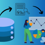
In today's data-driven world, transforming raw data into actionable insights is crucial for informed decision-making. This guide will walk you through the process of creating impactful reports and dashboards using Excel and transforming them to web-based reports using SpreadsheetWeb. Excel's versatility and robust functionality make it an ideal tool for handling various data-related tasks, from data cleaning and preparation to advanced visualizations and interactive dashboards. To be able to show you the whole process, we have prepared a demo application named Human Resources Dashboard.
In this guide, you will learn how to set up your workbook, import data, format it clearly, and use Excel functions like TEXT, DATE, and TRIM to clean your data efficiently, with examples from our application's Excel source file. Furthermore, you’ll explore powerful Excel formulas like SUMIFS, COUNTIFS, and AVERAGEIFS and discover the benefits of dynamic array formulas.
The importance of data-driven decision making
Data-driven decisions enable companies use their available information to enlighten and deliver smart choices. Data analytics translate into better predictions, performance measurement and trend spotting in business.
Effectively deploying and understanding data is a critical competitive advantage in the current marketplace. Fast response to market changes, optimizing operations, and finding new opportunities are some benefits that flow from excellent decision-making based on data collection. This entails gathering huge volumes of information from diverse sources, cleaning and preparing it meticulously for accuracy purposes before examining it for useful knowledge.

Data provides a clear and objective way to assess how well an organization is performing against its goals. As seen in the HR dashboard, metrics such as total salaries, total bonuses, total compensations, and average salaries can be tracked and analyzed to determine areas of success and those needing improvement. This ongoing performance evaluation helps organizations stay on track and continuously improve.
Informed predictions based on data analysis allow businesses to forecast future scenarios more accurately. Predictive analytics can be used to anticipate customer needs, optimize inventory levels, and plan for future growth. For instance, the HR dashboard's ability to project future employee growth and compensation trends helps in strategic planning and resource allocation. Organizations can reduce uncertainty and make more confident decisions by making predictions rooted in data.
The HR dashboard example illustrates how data-driven decision-making can be applied in a practical context. It allows organizations to track key metrics, visualize data trends, and make informed strategic decisions. By leveraging tools like Excel and SpreadsheetWeb, businesses can transform raw data into valuable insights that drive success.
Why Many Organizations Use Excel to Build Their Reports
Excel is a powerful and versatile tool widely used for data analysis and reporting. Its extensive range of functions, ease of use, and ability to handle large datasets make it a preferred choice for many organizations. Excel's compatibility with other software and its robust visualization capabilities further enhance its value for creating impactful reports.

One of Excel's most significant strengths is its extensive range of functions. From basic arithmetic operations to complex statistical analyses, Excel offers a function for nearly every type of calculation and data manipulation. Functions like SUM, AVERAGE, and COUNT provide foundational tools for simple analyses, while more advanced functions like VLOOKUP, INDEX-MATCH, and IFERROR enable sophisticated data handling and troubleshooting. Excel also supports powerful array formulas and dynamic functions such as FILTER, SORT, and UNIQUE, allowing more flexible and efficient data processing.
For instance, in the HR dashboard application, formulas like SUMIFS calculates total compensations and average salaries, respectively.

Dynamic arrays such as UNIQUE and SORT help organize data for clear and effective visual presentation.

Excel's ease of use is another key factor contributing to its widespread adoption. The user-friendly interface with intuitive menus and toolbars allows users of varying skill levels to perform data analysis tasks efficiently. Additionally, Excel provides extensive documentation and a wealth of online resources, including tutorials and community forums, which help users quickly learn and apply new techniques.
For example, the HR dashboard application demonstrates how even complex data sets can be managed with Excel's straightforward interface, allowing for quick updates and analysis without extensive training.
Excel's ability to handle large datasets is crucial for modern data analysis. The software can easily process and analyze thousands of rows of data and features like Power Query and Power Pivot extend its capacity to manage even larger volumes of information. These tools enable users to import, transform, and load data from various sources, creating a seamless data integration and analysis workflow.
In the HR dashboard, Excel handles extensive employee data across multiple years and departments, showcasing its ability to effectively manage and analyze substantial amounts of information.

Excel's robust visualization capabilities make it an invaluable tool for creating impactful reports. With a wide array of chart types, conditional formatting options, and the ability to create custom visuals using shapes and icons, Excel enables users to present data visually appealing and comprehensibly. Features like sparklines, data bars, and color scales provide additional ways to highlight key trends and insights within the data.

In the HR dashboard, diverse visualizations, such as bar charts, pie charts, and conditional formatting, represent data on employee growth, compensation, and departmental distribution, making the data more accessible and insightful.
Data Cleaning and Preparation in Excel
Effective data cleaning and preparation are foundational to creating reliable and insightful reports and dashboards. Here’s how to optimize your workbook for data analysis:
Setting Up Your Workbook
Begin by setting up your workbook for optimal data organization and analysis. Create separate sheets for raw data, cleaned data, and analysis to keep your work structured and easy to navigate. For example:
- Raw Data Sheet: This sheet contains the original imported data- if it exists- without any modifications. As your source data updates, you can easily copy it to the raw data sheet.
- Cleaned Data Sheet: This sheet includes processed data where errors, duplicates, and inconsistencies have been removed. Ensure you clean your raw data using data cleaning formulas like TEXT, LEFT, RIGHT, MID, SUBSTITUTE, FIND, SEARCH, TEXTJOIN, REPLACE, and TRIM. This will automatically sanitize your data as it gets updated.
- Analysis Sheet: This sheet aggregates and filters the cleaned data using relevant Excel formulas. The most common formulas for data aggregation and filtering are SUMIFS, COUNTIFS, AVERAGEIFS, FILTER, UNIQUE, PRODUCT, LARGE, SMALL, etc. These formulas combine the data into tables that can be used for visualizations such as charts and maps.
- UI Sheet: The UI sheet in the workbook serves as the user interface, providing interactive elements such as dropdown menus and filters to facilitate dynamic data analysis and visualization.
In our HR dashboard example, separate sheets were used for raw employee data, cleaned and structured data, and the final analysis, ensuring a clear and organized workflow.
Data Importing Techniques
Excel allows you to import data from various sources, such as CSV files, databases, and web pages. Use the "Get & Transform" feature to connect, load, and transform data from these sources efficiently. In the HR dashboard example, data from multiple locations and departments was imported using these techniques, ensuring a comprehensive dataset. Power Query was utilized to clean and shape the data by removing duplicates, filtering rows, and changing data types before loading it into the workbook. This streamlined process facilitated the seamless integration of diverse data sources, providing a robust foundation for further analysis.
Data Formatting Best Practices
Consistent data formatting is essential for accurate analysis. Use Excel's built-in formatting tools to standardize date formats, numbers, and text. For instance, in the HR dashboard, date formats were standardized to DD/MM/YYYY, and number formats, including currency and percentages, were consistently applied to maintain clarity.
Using Excel Functions for Data Cleaning
Excel offers a range of functions to clean and prepare your data. For example;
- TEXT: This function was used to format date values consistently. =TEXT(A2, "MM/DD/YYYY") converted dates into a uniform text format.
- DATE: This function ensures dates were correctly formatted, such as =DATE(YEAR(A2), MONTH(A2), DAY(A2))
- TRIM: This function removed unnecessary spaces from text data, ensuring names and other text fields were clean and uniform, e.g., =TRIM(A2).
Creating Visualizations in Excel
Choosing the Right Chart Type
Selecting the appropriate chart type is crucial for effective data visualization. Excel offers a variety of chart types, including bar charts, line charts, and pie charts. Choose a chart that best represents your data and conveys your insights clearly. For example, bar charts are ideal for comparing values across different categories, line charts are perfect for showing trends over time, and pie charts effectively display proportions within a whole.
Limitations of Excel
While Excel is a powerful tool, it has limitations in handling extremely large datasets and creating highly interactive dashboards. Understanding these limitations helps you make informed decisions about when to use Excel and when to explore other tools. For instance, when dealing with massive datasets that exceed Excel's row limits or require high-performance calculations, tools like Power BI or SQL databases might be more appropriate.
Creating Web-Based Reports and Dashboards with SpreadsheetWeb
Planning Your Dashboard Layout
A well-planned dashboard layout enhances usability and ensures that key insights are easily accessible. Organize your dashboard logically by grouping related information together and prioritizing the most important data. In the HR dashboard example, sections were clearly divided into areas such as employee growth, compensation, and departmental distributions. This organization allows users to quickly find and interpret the data they need, making the dashboard intuitive and user-friendly.

Using Controls for Filtering
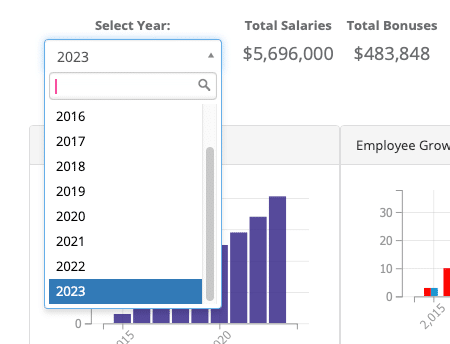
Interactive controls, such as drop-down menus and sliders, enable users to filter data and explore different views of the data. Implement these controls to make your dashboards more interactive and user-friendly. In the HR dashboard, controls were added to filter data by year, location, and department. This functionality allows users to customize their views and focus on specific subsets of data, enhancing the overall user experience and enabling more targeted analysis.
Real-World Example: Human Resources Dashboard
Creating a Dashboard in Excel
Composite and Excel-based tracking sheet or dashboard related to key areas of Human Resources such as employee turnover ratio, attendance pattern, and performance factors. In the second step, various charts are applied to enhance the data analysis and make it easily interpretable. For example, the use of bar graphs assists in presenting cases of the growth of employees over the years, while pie graphs help in depicting the proportionality of headcount by the regions, and line graphs assist in showing the performance scores over the period of time. One of the nice things about data is that it can be highlighted based on whatever criteria are deemed important at any given time. If it is desirable to highlight turnover rates, for example, as being high, then this can be done and vice versa for performances that have been scored above average.
Creating a Web-Based Dashboard with SpreadsheetWeb
Convert your Excel dashboard into a web-based dashboard using SpreadsheetWeb. This change facilitates visual and access arrangements so that the stakeholders can get real-time data and analysis in their hands. The future of the HR dashboard is more interactive and glamorous than the previous ones, being turned into an internet/utility-based variant that will be as advanced as the relevant Excel model in terms of the visualizations and the interactivity one is to engage in. This conversion makes it possible for all the members of the team to ‘use’ the dashboard on the online platform, which makes it crucial in aiding in the overall decision-making process of the team. Using SpreadsheetWeb, the dashboard transforms into a tool that focuses on handling and visualizing data, as well as the guarantee that crucial data will always be at the disposal of those who require it.
Knowing about the experience where large amounts of data play a key role in decision-making, the skills that help turn raw data into valuable insights are essential. Excel emerges as an exceptional tool that helps organizations in achieving this efficiency and preciseness of change. In this guide, we have come through different steps of making analytically striking reports and web-based dashboards with the help of Excel: Data preprocessing and analysis, different aspects of data visualization, and creating web-based dashboards using SpreadsheetWeb.
Overall, data analysis, charting, and web-based reporting in Excel provide insight and understanding that are critical in any organization that wants to gain more value from the data gathered in its business. Excel provides direct tools that can help transform static information into actionable solutions geared toward operations and strategy planning. The above techniques and tools should enhance organizational data utilization and fuel tremendous growth.