
Least Useful and Rare Formulas in Excel
Microsoft Excel is famous for having lots of powerful features. It has more than 400 different formulas that are great for making detailed data models, calculators, and other cool tools. Microsoft often adds new formulas and keeps the old ones too, so older Excel...How to Use Excel Sparklines for Better Looking Tables
Understanding Sparklines in Excel Sparklines, often referred to as 'inline charts,' are compact visual representations that neatly fit into individual cells within a spreadsheet. Unlike traditional charts, sparklines don't have axes or coordinates, providing an...Scatter Chart in Excel
An Excel scatter chart visually displays data points on a grid, with each point determined by values on the x-axis and y-axis. This type of Excel graph is handy for illustrating the relationship between two variables. The horizontal axis shows control parameters or...Understanding and Overcoming Known Formula Issues in Excel
Microsoft Excel is widely acclaimed for its sophisticated formula capabilities, enabling users to perform complex data analysis and calculations. However, mastering Excel is not without its challenges, particularly when it comes to understanding and resolving formula...How to Create a Pareto Chart in Excel
What is a Pareto Chart? Pareto Charts, named after the Italian economist Vilfredo Pareto, are a unique and powerful tool for data analysis and decision-making. A Pareto Chart is a combination of a bar and a line charts, essentially using both in a single...Organize and Analyze Data Quickly with Pivot Tables in Excel
In the dynamic realm of data analysis, Excel stands out as an indispensable tool, offering a multitude of features to streamline the process. Among these, PivotTables emerge as a powerful asset, providing a structured and efficient means to organize and analyze...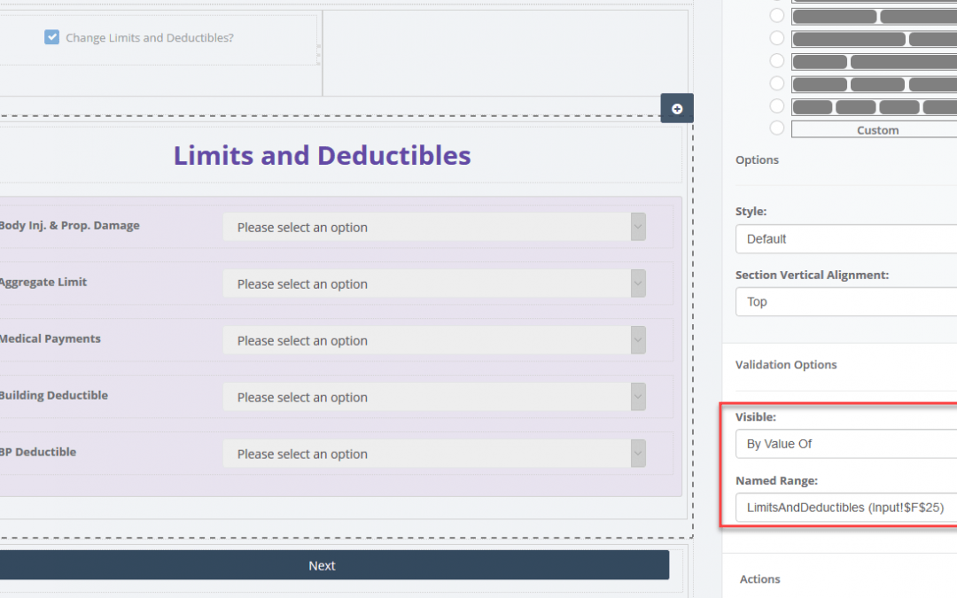
No Code for Dynamic User Interface: Hiding and Disabling Controls
Leveraging a no code platform with a dynamic structure can revolutionize your web application's user interface (UI), simplifying the data entry process and optimizing user time utilization. Within SpreadsheetWEB's designer applications, numerous controls can be...Excel Web App: A Solution to Boost Your Efficiency
Be it for maximizing profits, finding the best truck/aircraft routes, or deciding which bonds to invest in; businesses do optimization all the time. Whether they are aware of it or not, there often is one best solution...