A treemap chart is a type of data visualization that is especially useful for displaying hierarchical data. On a treemap, each item is represented by a rectangular shape, where smaller rectangles represent the sub-groups. The color and size of rectangles are typically correlated with the tree structure, which in return makes it easier to see the groups and sizes. Treemap charts are great for highlighting the contribution of each item to the whole, within the hierarchy. You can download the workbook we're going to be using in this tutorial here.
Treemap Chart Basics
Sections

A treemap chart mainly consists of 3 sections:
- Plot Area: This is where the visual representation takes place. Each rectangle is colored by the highest-level categories, and the sub-category (sub-branch) rectangles for each item is drawn proportional to the size of numerical value they each contribute to the aggregate dataset.
- Chart Title: The title of the chart. Giving your chart a descriptive name will help your users easily understand the visualization.
- Legend: The legend is the map that helps distinguish the data series. Each color represents one of the highest level categories (branches).

Inserting a Treemap Chart in Excel
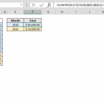
Begin by selecting your data in Excel. If you include data labels in your selection, Excel will automatically assign them to each column and generate the chart.

Go to the INSERT tab in the Ribbon and click on the Treemap Chart icon to see the available chart types. At the time of writing this article, there are 2 options: Treemap and Sunburst. Click the Treemap chart of your choice to add it chart.

Clicking the icon inserts the default version of the chart. Now, let’s take a look at customization options.

Customizing a Treemap Chart in Excel
You can customize pretty much every chart element and there are a few ways you can do this. Let’s look at each method.
Double-Clicking
Double-clicking on any item in the chart area pops up the side panel where you can find options for the selected element. Please keep in mind that you don’t need to double click another element to edit it once the side panel is open, the side menu will switch to the element. The side panel contains element specific options, as well as other generic options like coloring and effects.

Right-Click (Context) Menu
Right-clicking an element displays context menu with bunch op items as it happens in any application as well. You can modify basic styling properties like colors or delete item as well as activating side panel for more options. To display the side panel choose the options which starts with Format string. For example; Format Data Labels… in the following image.

Chart Shortcut (Plus Button)
In Excel 2013 and newer versions, charts also support shortcuts. You can add/remove elements, apply predefined styles and color sets and filter values very quickly.
With shortcuts, you can also see the effects of options on the fly before applying them. In the following image, the mouse is on the Data Labels item and the labels are visible on the chart.

Ribbon (Chart Tools)
Whenever you activate a special object, Excel adds a new tab(s) to the Ribbon. You can see these chart specific tabs under CHART TOOLS. There are 2 tabs – Chart Design and Format. While the Chart Design tab contains options to add elements, apply styles, modify data and modify the chart itself, the Format tab provides more generic options that are common with other objects.

Customization Tips
Preset Layouts and Styles
Preset layouts are always a good place to start for detailing your chart. You can find styling options from the Chart Design tab, or by using the brush icon on Chart Shortcuts. Below are some examples.
Applying a Quick Layout:

Changing colors:

Updating the Chart Style:

Changing chart type
You can change the type of your chart any time by Change Chart Type dialog. Although, most of the chart types has multiple variations, Excel currently supports only a single type for treemap charts.
To change the type of your chart, click on Change Chart Type in the Right-Click (Context) Menu or Design tab.

In the Change Chart Type dialog, you can see the options for all chart types with a preview of your chart. Unfortunately, you don't have any other options other than sunburst for the time being.

Switch Row/Column
Excel assumes that vertical labels are categories and horizontal labels are data series by default. If your data is organized the other way around, note that Switch Row/Column button in Chart Design tab is disabled, and you will have to transpose your data manually.

Move a chart to another worksheet
By default, charts are created inside the same worksheet as the selected data. If you need to move your chart into another worksheet, use the Move Chart dialog. Begin by clicking the Move Chart icon under the DESIGN tab or from the right-click menu of the chart itself. Please keep in mind you need to right-click in an empty place in chart area to see this option.

In the Move Chart dialog you have 2 options:
- New sheet: Select this option and enter a name to create a new sheet under the specified name and move your chart there.
- Object in: Select this option and select the name of an existing sheet from the dropdown input to move your chart to that sheet.