This guide will show you how to do linear regression in Excel, but first, let's learn what exactly linear regression is.
Linear Regression
Linear regression is a fundamental statistical method to determine the relationship between two variables. This process is simplified by the linear regression equation, illustrating the connection between a dependent variable (y) and an independent variable (x). The equation is represented as:

Where:
- \(y\) represents the Dependent variable, indicating the outcome or variable being predicted.
- \(b\) is the slope of the regression line, showing the change in \(y\) for a one-unit change in \(x\).
- \(x\) denotes the Independent variable, the predictor or factor that influences \(y\).
- \(a\) is the y-intercept, the point at which the regression line crosses the y-axis, indicating the value of \(y\) when \(x\) is 0.
- \(\epsilon\) - ε signifies the Error term, encompassing all other elements affecting \(y\) aside from \(x\).
Thankfully, leveraging "linear regression in Excel" does not require the manual computation of this formula. Excel offers an integrated function to perform regression analysis, simplifying the application of linear regression to your data model. This feature underscores how to run linear regression in Excel, ensuring that users can easily calculate linear regression in Excel without delving into complex statistical calculations manually. You can efficiently execute regression analysis in Excel using Excel's regression tool, making it straightforward to interpret regression results and apply them to practical data analysis and forecasting scenarios.
Analyzing Linear Regression in Excel
Performing linear regression in Excel is straightforward, especially when using charts and trendlines. Here's a step-by-step guide to make it simple:
1. Start by clicking on a cell within your dataset.
2. Go to the "Insert" tab, choose "Insert Scatter (X, Y) or Bubble Chart," and then select "Scatter."

To incorporate a trendline important for linear regression in Excel, follow these steps: Click on the large plus (+) button, "Chart Elements," next to your chart. Then, look for the "Trendline" option and select "Linear" from the list. This action will add a linear trendline to your scatter chart, visually representing the linear regression model based on your data.

After adding the trendline to your chart for linear regression in Excel, you can further customize it and display the regression equation directly on the chart. Double-click on the trendline to bring up the properties pane on the right side of your Excel window. Then, look for an option that says "Display equation on the chart" and check it. This will show the linear regression equation on your chart, which is useful for understanding the relationship between your variables.
Optionally, if you want to customize the appearance of your trendline, navigate to the "Fill & Line" section in the properties pane. Here, you can change the trendline color and select a different line type to match your preferences or make the chart clearer.

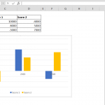
Customizing the color of your trendline and adjusting the x-axis enhances the clarity and visual appeal of your linear regression analysis in Excel. You can see the improvement in the image below since we changed the color of the trendline and adjusted the x-axis for better visibility.

What does the trendline tell us?
The trendline in linear regression analysis in Excel visually represents the relationship between the independent (explanatory) variable and the dependent (outcome) variable. Here's what the trendline reveals about this relationship:
1. Positive Slope (Upward Trend)
When the trendline slopes upwards, the two variables indicate a positive correlation. This means as the value of the independent variable increases, the dependent variable also tends to increase. For example, in a study examining the relationship between study time and exam scores, an upward-sloping trendline would suggest that more study time is associated with higher exam scores.
2. Negative Slope (Downward Trend)
A trendline with a downward slope signifies a negative correlation. Here, as the independent variable increases, the dependent variable decreases. An example could be the relationship between the number of hours spent on leisure activities and academic performance, where an increase in leisure time might correlate with lower academic performance.
3. Horizontal Line
If the trendline is horizontal, it suggests no significant correlation exists between the independent and dependent variables. This means changes in the value of the independent variable do not predictably affect the value of the dependent variable. The two variables do not show a linear relationship based on the data analyzed.
Understanding the direction and angle of the trendline is crucial in linear regression analysis as it helps predict how changes in the independent variable are likely to impact the dependent variable, offering valuable insights for decision-making and forecasting.
Regression Analysis in Excel ToolPak Feature
Enabling the Analysis ToolPak for Regression Analysis in Excel
Compression analysis in Excel becomes significantly more powerful with the addition of the Excel's Analysis ToolPak. This Excel add-in equips you with advanced analytical capabilities, including the ability to perform complex regression analysis easily. Here's how to get started:
Begin by navigating to the "Tools" menu. This is where you'll find options to enhance Excel's functionality. Select "Excel Add-ins" from the menu. This action opens a dialog box listing available add-ins for Excel.

Look for the "Analysis ToolPak" in the list. Once you find it, check the box next to it. This step is crucial as it enables the add-in.

Confirm your selection by clicking "OK." This adds the Analysis ToolPak to Excel, specifically integrating it into the "Data" tab.
Configuring Regression Analysis Settings in Excel's Analysis ToolPak
Input Y Range: Start by selecting your dependent variable. In our scenario, it's the range of actual data. This variable is what you're trying to predict or explain.
Input X Range: Next, select your independent variable(s). We use the "predicted" range as the independent variable for this example. If you're working on a multiple regression analysis, choose two or more adjacent columns for different independent variables here.

Labels: If your data ranges include headers, check the "Labels" box. This ensures Excel recognizes and correctly uses the headers in your analysis.
Output Options: Decide where you want the analysis results to be displayed. Selecting "New Worksheet" is a good choice to keep your analysis organized and separate from your raw data.
Residuals: For a deeper insight into the accuracy of your model, consider selecting the "Residuals" checkbox. This option provides the residuals, which are the differences between the actual and the predicted values. Analyzing residuals can help identify patterns the model may not have captured.

By carefully setting up these options, you'll be equipped to perform a regression analysis, shedding light on independent variables. This process enhances your understanding of the data and empowers you to make informed predictions and decisions.