Understanding Sparklines in Excel
Sparklines, often referred to as 'inline charts,' are compact visual representations that neatly fit into individual cells within a spreadsheet. Unlike traditional charts, sparklines don't have axes or coordinates, providing an immediate snapshot of data trends. The beauty of sparklines lies in their seamless integration 'in-line with other data,' making them ideal for side-by-side comparisons with actual data.
Introduced by Excel in 2010, sparklines have become an invaluable tool for visually conveying trends in a concise manner. Whether you're monitoring stock price fluctuations, tracking periodic sales figures, or presenting other tabular data, sparklines offer a quick and clear visualization.
In Excel, creating sparklines is a breeze. The built-in tool provides a choice of three types of sparklines, each offering additional customization options. Let's delve into the process to enhance your presentations. For a hands-on experience, feel free to download our sample workbook below.

Are you ready to elevate your Excel game and gain valuable insights from your data? In this guide, we'll delve into the world of Excel sparklines – powerful visualizations that offer a snapshot of data trends with ease.
Getting Started: Creating Excel Sparklines
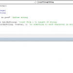
Begin by having your data table ready, just like the one below.

Select Your Values: To create Excel sparklines, Highlight the set of values you want to visualize.

Insert Sparklines: Head to the INSERT tab in the Ribbon, where you'll find three sparkline types – Line, Column, and Win/Loss. Choose the one that suits your needs.
Define Ranges: A pop-up dialog appears. Enter the data range and the location range. If your data is already selected, focus on where you want the sparklines. Click OK to add sparklines.

Here, you will need to enter range for data (Data Range) and a range for the sparklines (Location Range). If you have already selected your data, your only need to select where the visualizations are to be placed. We recommend placing the sparklines next to the data.

Click OK to add sparklines into the specified range. You can now see an overview of the correlation between numbers at a glance. Let’s continue with how you can further customize Excel sparklines for your taste.

Sparkline Tools
If you select a cell or range containing sparklines, Excel will display a new tab in the Ribbon named SPARKLINE TOOLS. Go to this tab to see available options to customize the sparklines.

These options are grouped under 5 sections:
| Sparkline |
Edit data and sparkline ranges. Choosing the method to handle gaps or empty cells. |
| Type | Change the type of the sparklines. |
| Show | Place indicators on or highlight specified values. |
| Style |
Change color schemes of the sparklines. Detailed options of the features in the Show section. |
| Group |
Add/remove/modify axes. Group or ungroup sparklines in a range. |
Let's modify the sparklines to match the color scheme of our data table, and also add coloring for high and low values. To do this, start with selecting the range of sparklines.

Select a color of your liking from the Style selector.

Go to Marker Color > High Point to select a color for high values from the palette, and then repeat the same thing for the low values. In this example, we are using green for High and red for Low values.

If your data is similar to ours, you might be having some trouble seeing the low values. The reason behind this is how Excel automatically creates the axes. To enter a custom range, go to Axis > Custom Value under the Vertical Axis Minimum Value Options section and set a value. We used “0” in our example.

And voila! This representation provides an excellent overview of the big picture at a glance, as you no longer have to add and subtract each column or row in your head.

In conclusion, mastering Excel sparklines opens up a world of possibilities for efficient data analysis. By creating and customizing these visualizations, you can gain valuable insights at a glance, eliminating the need for complex mental calculations. Whether you're tracking trends, identifying high or low values, or simply presenting data in a visually appealing manner, Excel sparklines empower you to make informed decisions swiftly. So, the next time you're working with spreadsheets, charts, or graphs, consider incorporating sparklines to elevate your data visualization game and streamline your analytical processes. Excel sparklines: where simplicity meets powerful insights.