Bing Maps is an add-in for Excel, that has been featured since Excel 2013 to create dynamic maps in your Excel workbook. You can create a dynamic map with data visualizations by using location data in your workbook. In this article, we are going to show you how to embed a Bing map in Excel.
Embedding Bing Maps in Excel
You can find the Bing Maps icon in the Insert tab of the Ribbon. It is located under the Add-ins section, and has the Bing logo.

Clicking the button embeds a Bing Map interface with a sample data option. Click the Insert Sample Data button to let the add-in to populate a sample data starting by active cell.

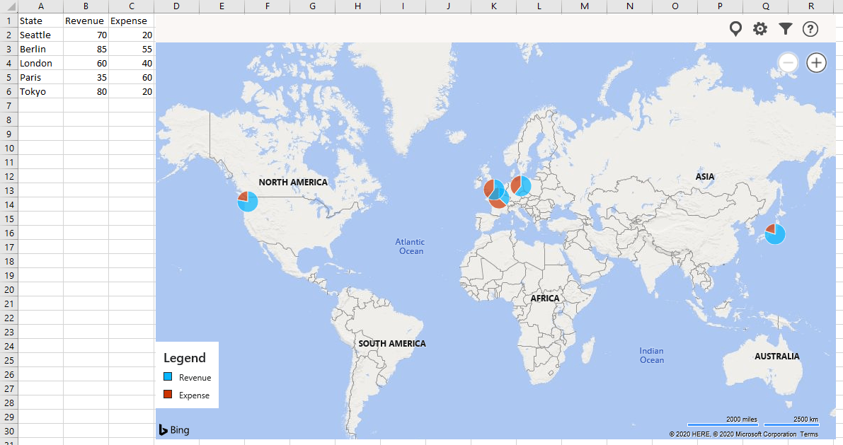
Upon clicking the button, you will see a map is generated based on the selected dataset. You may need to resize you map to see values from Seattle to Tokyo.
You are not just limited to city names. You can use address, country, state, ZIP code and longitude/altitude data as well with this nifty add-in. For example, here is aversion with country names.

Selecting a range for the map
You have two options to set a datarange for your map:
- Either you can select your range and click on location icon

- or you can prefer Select Data dialog in Filters

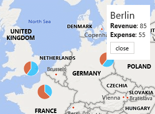
Here you can see both approaches:

Indicators and Data Visualizations
You may have noticed that the previous two maps are using different kind of indicators: pie charts and circles. These are data visualizations and indicators.
If you select a range that contains more than one column of data, you can use pie charts as a visualization. Pie charts are great for showing the proportion of each item in the data set. Each chart will have the same size, however the pie sizes will be proportional to the values used.
On the other hand, the circle approach visualizes the actual values. The size of a circle corresponds with the values. For example, the circle on China is bigger than other countries because, it is the most populated country.

Customization on embedded Bing Maps
Bing Maps allows you to customize the map type, legend visibility and colors as well as data indicators. Let’s take a closer look at configuring these properties.
Click the gear icon 

These options will affect the chart immediately. Try and find a layout that fits your needs best. Click the right arrow icon near the title to close the pane.
Filtering
You can also add some basic filtering on embedded Bing Maps. Click on the filter icon 

That's all - you can now easily embed Bing Maps in Excel and visualize your location data!